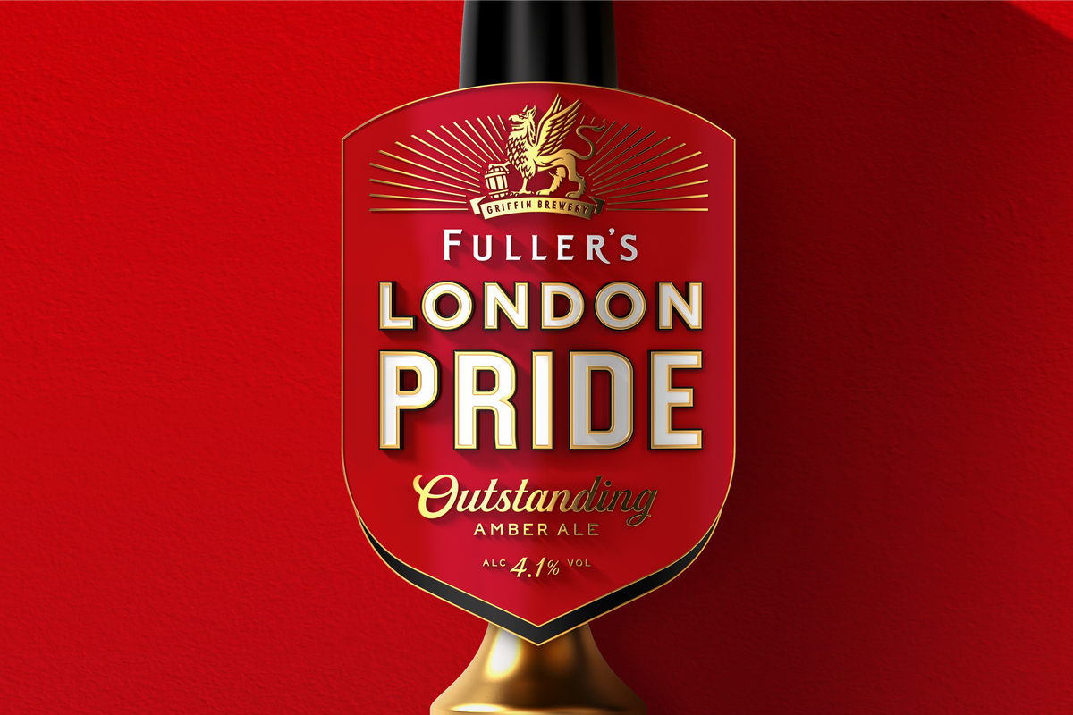
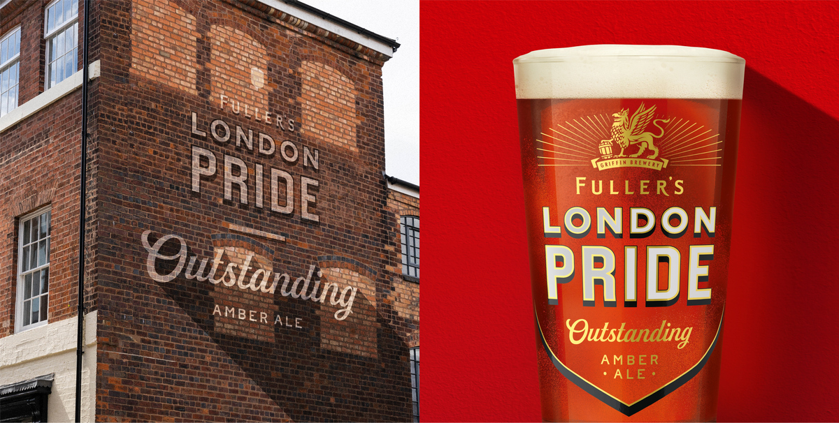
Fuller’s is introducing a new look for flagship brand London Pride across all its draught and packaged iterations, and glassware, too.

The contemporary look takes inspiration from the brand’s heritage, long-standing traditional brewing methods, and craftsmanship, all centred around the message of an ‘Outstanding Amber Ale’.
As one of Britain’s most iconic beers, it was vital to celebrate the history of the brand and draw on language found in the brand’s archives.
The iconic Griffin still takes pride of place, and new sign-style typography is reminiscent of the gilded lettering seen on windows and mirrors across London’s pubs.

The evolution of the London Pride pumpclip over time
Tim Clay, managing director of Fuller’s owner Asahi, said: “Fuller’s London Pride is an iconic beer and we wanted to celebrate the timeless nature of the brand in a way that will resonate with both established London Pride fans, whilst allowing new consumers to discover its exceptional quality. The new design represents an exciting next step in the long and storied journey of London Pride.
“Firmly established within the Asahi portfolio, London Pride sits within an unrivalled line-up of premium brands, and we are committed to building upon its existing strength and heritage to further unleash its potential.
“Bottled ale drinkers continue to be extremely valuable to the beer market, with the share of spend in the category currently highest amongst the older, more affluent demographic.

“Cask ale has undoubtedly suffered at the hands of the pandemic, but remains at the very heart of London Pride, and we aim to be at the centre of the category’s rejuvenation and recovery following the reopening of the on-trade.
“At Asahi UK, we’re committed to working with our customers to champion brilliant quality, every time. We are proud to be celebrating this amazing, premium beer. and look forward to supporting its future growth.”


