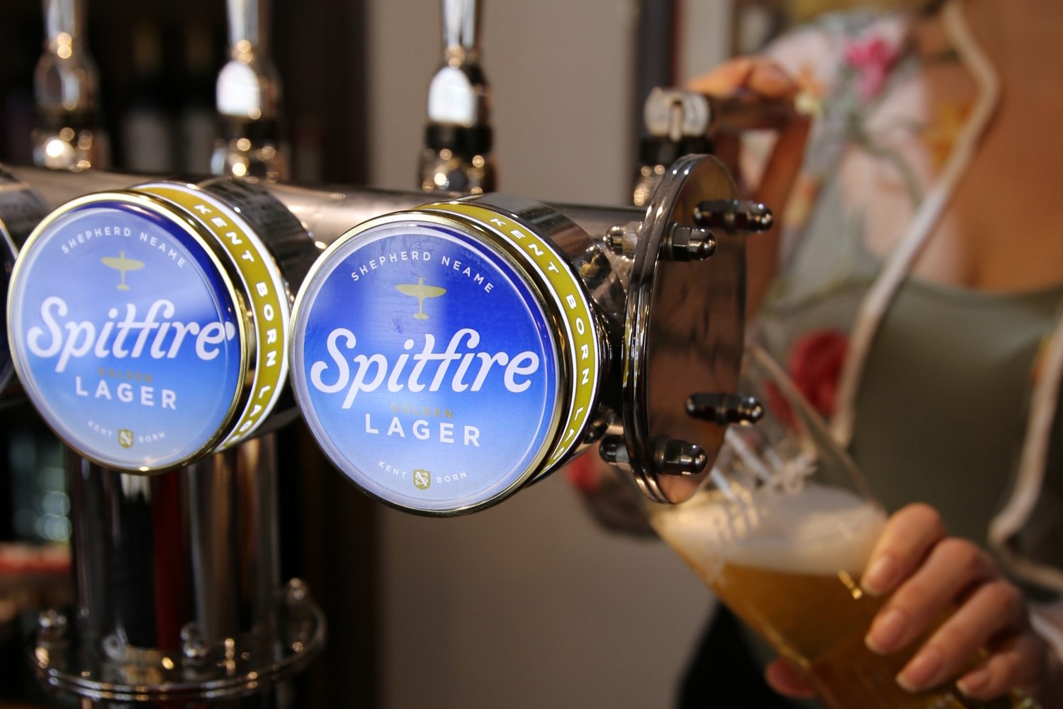
Shepherd Neame has unveiled a new look for its 4% ABV Spitfire Lager, created in partnership with the Thirst agency.

The visual identity incorporates a bespoke hand-drawn Spitfire logo emulating the vapour trails created by the iconic wartime aircraft which the beer takes its name from.
It retains a Spitfire silhouette, along with a recrafted Shepherd Neame monogram, inspired by its heritage as Britain’s oldest brewer. This is accompanied by the text ‘Kent Born’, drawing upon the provenance and quality of its centuries of brewing experience.
The Spitfire Lager keg lenses also have an eye-catching additional gold collar.
“Spitfire is a beer that not only represents the history of Britain, but also the modern credentials of the Shepherd Neame brand,” said Matt Burns, executive creative director and co-founder of Thirst.
“I”It’s not often a brief like this comes along, and it provided Thirst with a perfect opportunity to celebrate the historic and the modern in equal measure.
“With typography being the centrepiece of the new identity, we crafted a wordmark that felt fresh and interesting for a younger consumer, but with distinguishable hand finishes that offer the feeling of credible nostalgia. We evolved the colour palette to link directly to the open Kentish skies where the Spitfires once soared. The blue still feels proudly British yet through a modern lens.”

