St Austell Brewery has unveiled a new look for its flagship IPA, Proper Job, which affects all its iterations, from cask and keg to packaged beer.
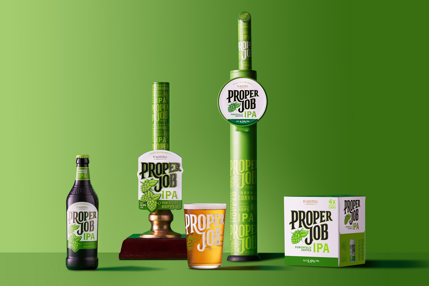
The inspiration behind the rebrand was to fuse heritage and heartfelt craft with relevance to today’s market. It features a new typeface, while Proper Job’s iconic green is more prominent.
The rebrand includes new glassware and pumpclips in pubs, as well as new look bottles and can packs in supermarkets. It is being supported with a multi-channel marketing campaign, which will launch in the spring.
“Since the brand launched in 2006, the beer category has changed significantly, and it had been a little while since Proper Job’s look had evolved,” said Laura McKay, marketing and communications director at St Austell Brewery.
“Proper Job is a famous Cornish phrase meaning ‘a job well done’. Just like its name, we’ve spent over a year perfecting the beer’s new look and testing it with beer drinkers and fans of the brand.
“Our investment in the brand is all about honouring Proper Job’s loyal drinkers with a design that doesn’t stray too far from its roots, as well as reaching new audiences with its fresh look and feel. There’s absolutely no change to the much-loved IPA’s recipe.”


