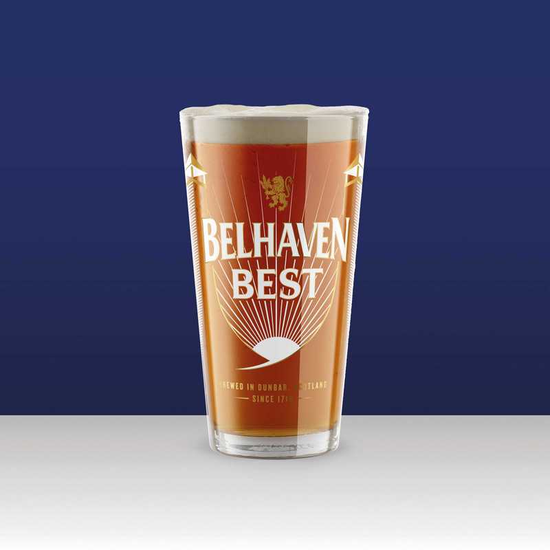
Scotland’s best-selling ale, Belhaven Best, has a new look, a striking blue and gold design, developed with design agency Thirst.
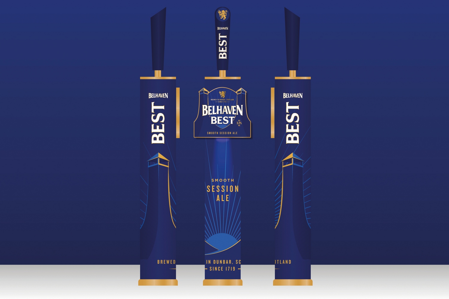
There’s a nod to the iconic malting chimneys of Belhaven Brewery, where Best is made, while rays of sunshine flooding through these chimneys represent the brewery’s hometown of Dunbar, on East Lothian’s coastline.
But while the look has changed, the recipe has remained unchanged. The rollout of new look Best will begin in mid-May, with venues receiving new fonts, tap handles, and keg lenses.
“Belhaven’s success over the past 300 years is built on creating exceptional quality beers, but also on our ability to respond to the changing tastes of modern drinkers,” said brand manager Fiona Matheson.
“Best is as popular as ever and is currently gaining in market share, but we felt that it deserved better when it came to its presentation. We also wanted to challenge the old-fashioned image of ale and communicate its freshness.
“This has been a labour of love that the Belhaven team has worked on for many months, and we are thrilled with the results! The new design looks stunning, premium and appealing, perfectly balancing Best’s past and our ambition for the future, whilst reflecting the wonderful qualities of the ale inside.
“We know our customers are going to appreciate and love it.”