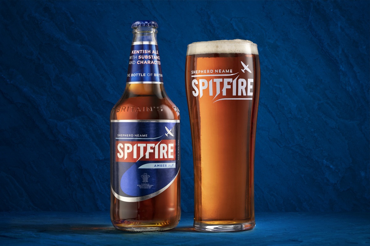
Shepherd Neame has unveiled a new look for its best-selling Spitfire, depicting the namesake plane soaring through the heart of the logo.
Its upward trajectory is mirrored in the dramatic curve of the label. In addition, Spitfire Lager and Spitfire Golden Ale have also been refreshed in the same manner.
Shepherd Neame’s head of marketing, Joanna Richardson, said: “When we speak to consumers about Spitfire, there’s a sense of pride, an emotional investment in the brand that cuts through generations. This new design perfectly captures the dynamism and emotion Spitfire evokes as a timeless
British classic.
“At Shepherd Neame, we don’t talk about team spirit, we talk about the ‘Spitfire spirit’ — steadfast, loyal, gutsy, individual, and full of character, just like the beer.”
Spitfire Amber Ale is an international success, sold in more than 40 countries, carrying a Royal Warrant, and having the same protected status afforded to Champagne.
Shepherd Neame and Spitfire enjoy a long-standing partnership with Kent County Cricket Club, and the T20 team will also be sporting the new logo on their kit from July onwards.


