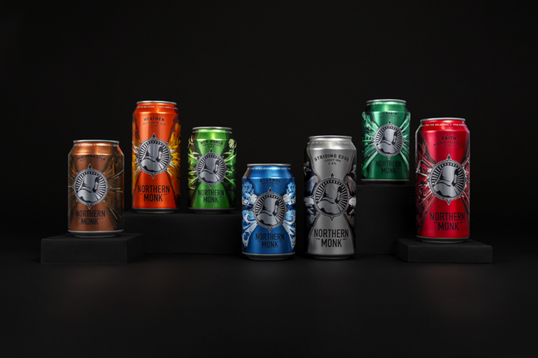
Northern Monk has today revealed a total brand refresh, with an updated logo, new website, and rebranded packaging across all seven of its core range beers.
Northern Monk started life in a parent’s cellar in 2013, and in five years has grown into one of the top 100 breweries in the world, according to Ratebeer, exporting to 23 countries.
Northern Monk has undertaken a hugely successful journey since its inception, and today the brewery is revealing a refreshed identity that illustrates the evolution of the brand.
Following a crowdfunding campaign, during which the brewery raised £1.5m in 13 days, Northern Monk’s rebrand has been completed by Leeds-based agency Robot Food. The refreshed logo features a much cleaner, simpler compass design, with the original monk icon remaining the same.
For the new can designs, Robot Food used illustration and colour to create a world around the beers, capturing the emotion behind each. Colour is used to evoke the nature of each beer style and flavour. Each beer has been given its own personality and story which was then used to influence the illustration.
The rebrand also sees two new beers entering Northern Monk’s core range: Origin, a 5.7% ABV gluten-free IPA, and Striding Edge. The latter was originally released as part of Northern Monk’s Patrons Project series and was so well received that the light IPA has been built into the core range.
‘Something to get excited about’
The rebrand is brought to life further through Northern Monk’s new website. This project was completed by Leeds-based website developer, Built by Mike.
Northern Monk founder, Russell Bisset, said: “The intention of our crowdfunding campaign was always to refresh, expand and reach more people in new places. We needed every element of our brand to be representative of how far we’ve come since the beginning our journey, and give our supporters something to get excited about.
“Robot Food understood our vision. We trusted them to amplify what we saw as important for our brand, and the end result is something that we’re both really proud of.”
Rich Robinson, senior designer at Robot Food, added: “Northern Monk is a pillar of not just our community, but of Northern brewing. Their beers are explosions of creativity that thrive around this. We wanted to better tell this story through each core range beer.
“We began by refining the monk and clarifying his role in the narrative. The monk now acts as a constant beacon, symbolising the brand and the attitude of the brewery. A burst emanates from the monk as a visual expression of the flavour and character of each core beer. Our deep dive into the brand gave us the insight to create concepts behind each beer and carve a narrative that reflects their flavours and origins.”


