A new corporate identity has been unveiled by Kent brewer and pub operator Shepherd Neame, highlighting its ‘Britain’s Oldest Brewer’ strapline.
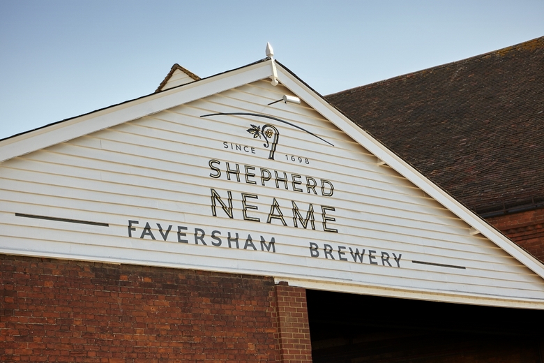
The project affects all areas of the independent family business, including its historic Faversham brewery, pub signage on its 330 pubs and hotels, marketing collateral and certain beer brands.
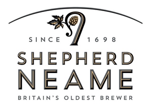 The brewery’s distinctive crook motif has a more premium look and now reflects its association with Kent’s world-renowned hops. An arc above the crook frames the identity with a horizon line and echoes the local landscape as well as features within the brewery.
Premium, modern typography conveys Shepherd Neame’s character, strong roots and principles. This is further enhanced by referencing both the official establishment date of 1698 and the fact that Shepherd Neame is Britain’s oldest brewer.
The new identity was developed by Kent creative agency JDO Brand & Design whose previous award-winning projects with the brewery have included revitalising Spitfire Ale, Master Brew and the Whitstable Bay collection.
JDO creative director, Ray Smith, said: “We’ve taken inspiration from the brewery’s provenance, borrowing the rich and vibrant colours of Kent for the new identity. The Shepherd Neame brand identity is such an important asset for the business and we believe we’ve articulated the values and personality of this iconic British business.”
Shepherd Neame chief executive, Jonathan Neame, added: “We are delighted with our new identity, which takes inspiration from the brewery’s past and present. The project covers all aspects of this diverse company and articulates our brand positioning and the company’s strategic ambitions. We congratulate the JDO team, who have done a great job.”