Innis & Gunn has unveiled a new look for its Originals range, led by its flagship beer, The Original.
The new design signals another step forward for the premium beer brand, which is now in its 18th year.
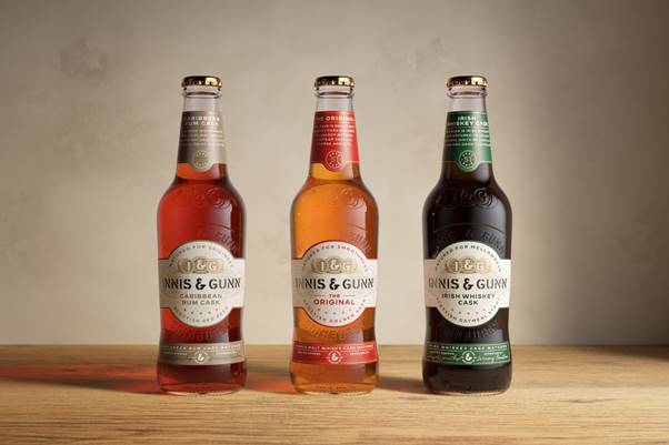
In research, target drinkers responded well to the new look of The Original, Caribbean Rum Cask (formerly Blood Red Sky), and Irish Whiskey Cask.
Each of the beers is now in a clear glass bottle, so consumers can clearly see the colour of the beer inside. The bottles are embossed, highlighting the Innis & Gunn brand name and the brewer’s home city, Edinburgh.
Considerable investment has also gone into the updated designs, with detailed depth including gold foil, print embossing, and watermarks. Subtle language updates have also been made to better reflect Innis & Gunn’s innovative brewing style, provenance, and consumer understanding.
As a final touch, the labels feature the signature of master brewer Dougal Gunn Sharp and an ‘approved by’ signature, which has been awarded to Innis & Gunn team member Jeremy Houston, to mark his decade with the business.
Design and confidence
Dougal said: “We have big ambitions, and this packaging update supports our growth strategy, especially as we look to roll out in England, bringing our premium beers to new drinkers.
“There is no change to the beers themselves in terms of taste or the methods we use to brew them. Our drinkers love our beers and Innis & Gunn performs well around the world, so there is absolutely no need to change their recipes. Additionally, these beers have been awarded at the highest levels, most recently at Monde Selection, where each was awarded grand gold.
“We believe this rebrand simply brings our packaging in line with the quality of beer within the bottle. We are extremely proud of the beer we make. Each of our Originals is just that, original. The new look is standout both in its design and its confidence.”